The advertisement-mill begins with developing two single-page magazine hardcopies. Then with a little skill and some focus the ad campaign continued to social content development.
Beginning with two standard sized content windows, 250 by 250 pixels and 300 by 300 pixels. After much 2d contemplation and strategic design implementation, the final product was enveloped within a common Instagram mockup for deployment.


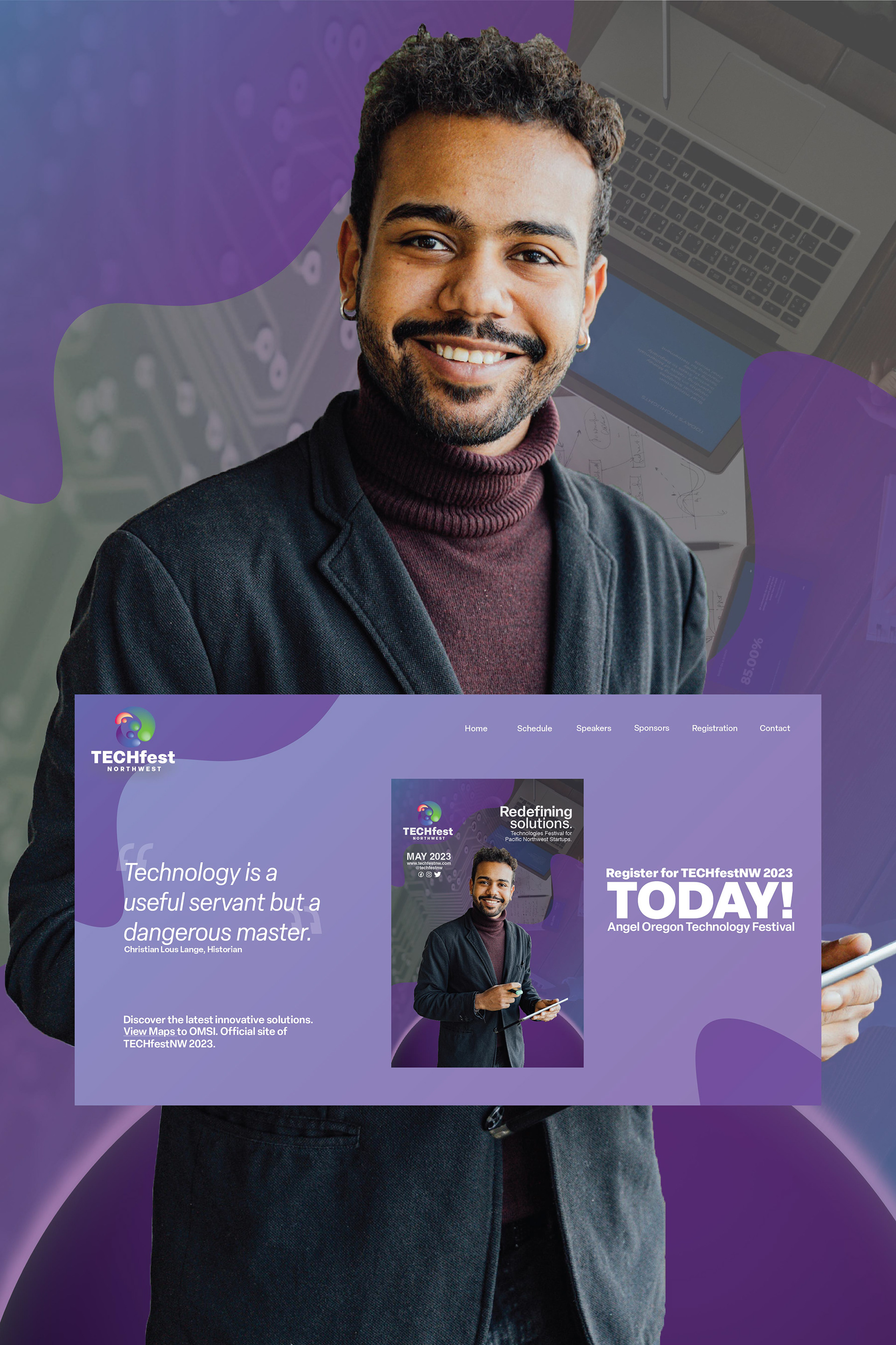
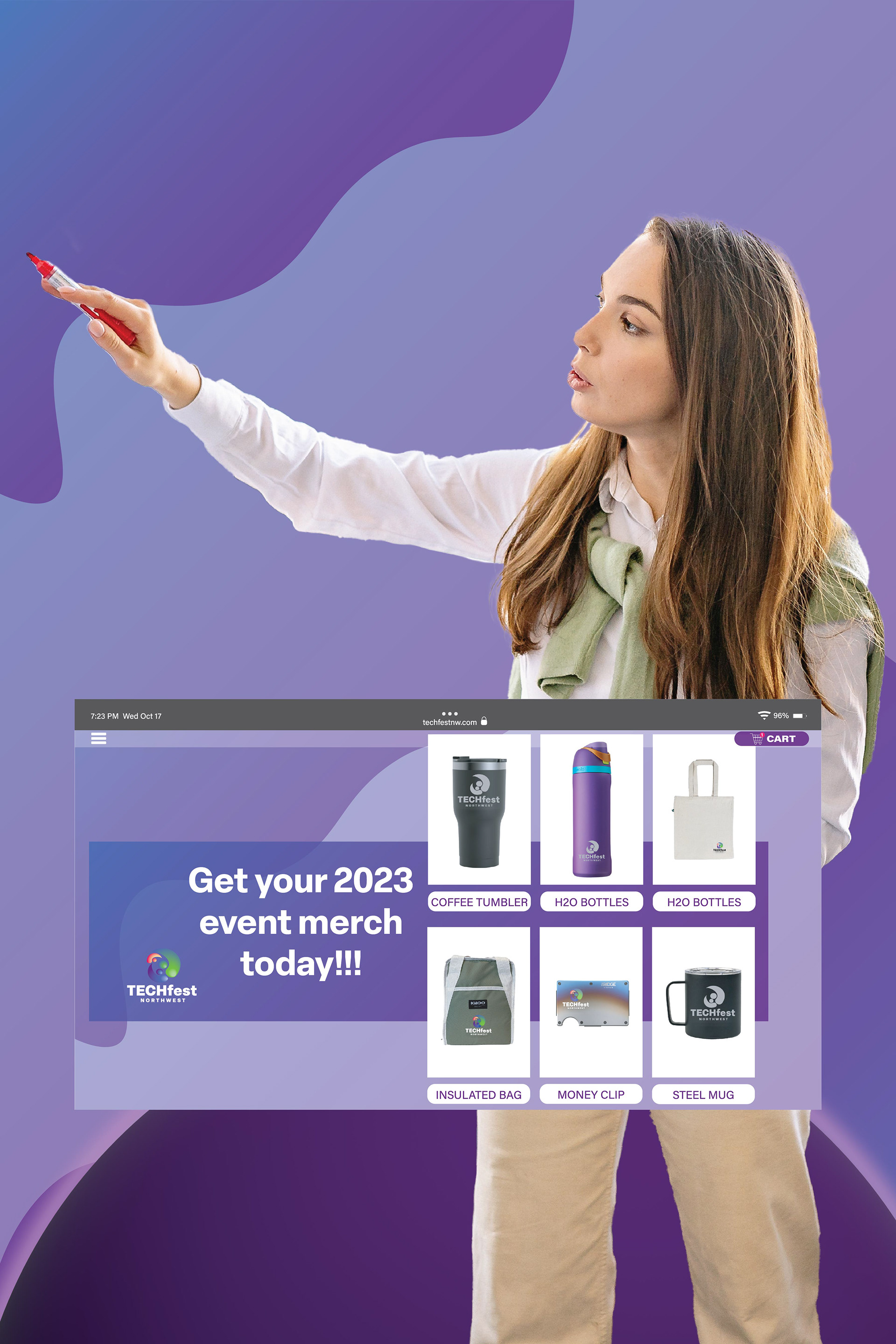
Creating a website mockup can be a challenge. Especially a clean and seamless look! These website mockups builds upon the original interface design components at the beginning of the festival redesign. The feel and presence does begin to shift towards a much simpler- more precise, aesthetic.


Enjoy the rebrand of TECHfest Northwest, a technology festival for northwestern startups. The focus of this project was to take a commercial forum/conference and apply design skills to remaster its presence.
This fall senior seminar project highlights all the branding and packaging elements students have learned throughout their courses at Fort Lewis College.
Logo design, typeface sampling, and advertising components begin this path to resurface the brand identity of a choice festival. Creating a marketable product that is sure to build consumer traffic and promote festival activity/attendance.
The beginning of the project research and ideation exploration pushes students to discover shape representation, apply recognizable color dynamics, and finish with target marketing typography. Applying personal stylization rhetoric and preserving creative potential- the design process becomes all encompassing.