Brand packaging an airline experience can be such a challenging design undertaking.
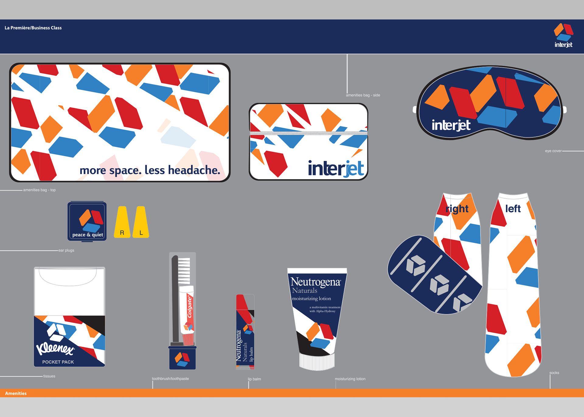
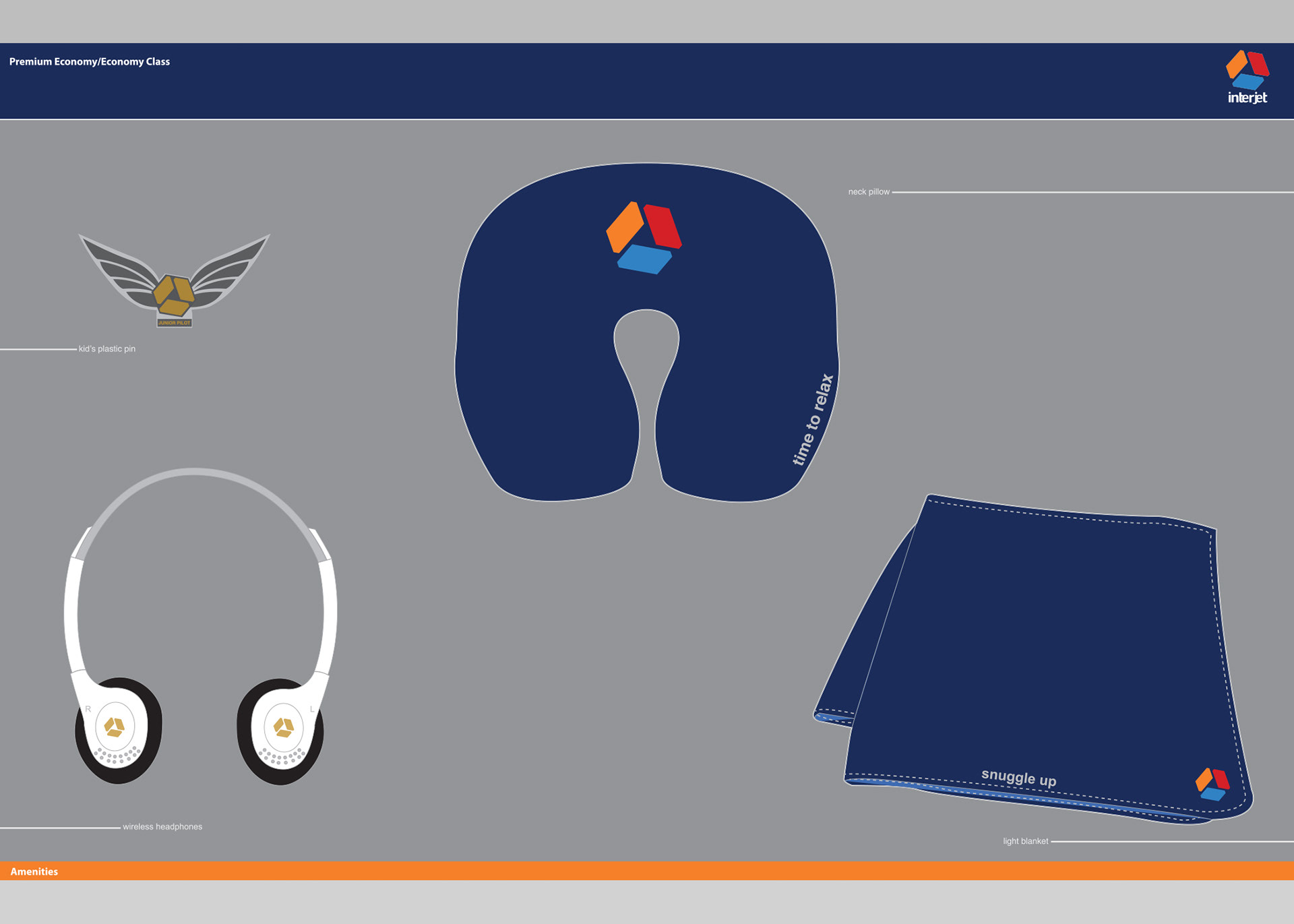
Developing a logo-mark that conveys a brand's signature strength and dependability is not easily executed. Here, simplicity is the guiding design principle. One universal shape and three colors translate how an airline industry leader in Central America can truly move people.
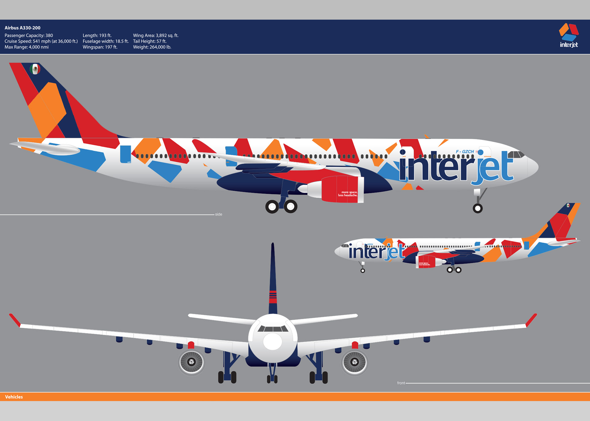
Not just in the skies- the tarmac at local airports is the unmistakable home of these colorful cloud ships! The easy brand recognition color scheme of vibrant colors drives patron desirability and loyalty. Dressed in a characteristic camouflage print, the exterior is covered in signature eye-pupil shaped triangles. Conveying the presence of observant care and quality service. The "eye" of the Interjet logo-mark connects patrons with all the internal-unconscious reinforcements of an ever-watching "Eye." The shape of the "eye pupil" is triangular. A shape synonymous with strength, divinity, and durability. The perpetual eye-pupil of the Interjet airlines will take care of it's loyal patrons. Unlike this external camouflage backsplash- a seasonal brand opportunity!


